Home
Microsoft Unveils a New Look and Logo
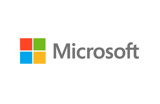
Microsoft has today unveiled its new company logo ahead of the launch of Windows 8 on October 26th. The wavy edges have been banished from the new logo, however, the coloured squares remain the same and they’re in the same order, but now enclosed in a square. The new logo fits in the Windows “Metro” feel which runs across Windows 8 and Windows Phone. It also similarly looks like the new Windows 8 Logo which was unveiled in February.

The new logo also marks the first time the computing giant has changed its company logo in 25 years.
Microsoft said: “It’s been 25 years since we’ve updated the Microsoft logo and now is the perfect time for a change. This is an incredibly exciting year for Microsoft as we prepare to release new versions of nearly all our products.
“From Windows 8 to Windows Phone 8 to Xbox services to the next version of Office, you will see a common look and feel across these products providing a familiar and seamless experience on PCs, phones, tablets and TVs.
“This wave of new releases is not only a reimagining of our most popular products, but also represents a new era for Microsoft, so our logo should evolve to visually accentuate this new beginning.”
The new logo is already in place at three Microsoft retail stores: in Seattle’s University Village; in Bellevue, Wash.; and in the Boston store and will be making its way to other stores over the next few months.
Microsoft added: “The Microsoft brand is about much more than logos or product names. We are lucky to play a role in the lives of more than a billion people every day. The ways people experience our products are our most important ‘brand impressions’. That’s why the new Microsoft logo takes its inspiration from our product design principles while drawing upon the heritage of our brand values, fonts and colors.
“The logo has two components: the logotype and the symbol. For the logotype, we are using the Segoe font which is the same font we use in our products as well as our marketing communications. The symbol is important in a world of digital motion (as demonstrated in the video above.) The symbol’s squares of color are intended to express the company’s diverse portfolio of products.”
Take a look at the introduction to the new video, below:











Recent Comments