Home
Apple Releases iTunes 11; Plus All You Need to Know
Apple’s iTunes 11 officially launched to the public today, after an unveiling in September at the iPhone 5 special announcement event. Originally planned for an October release, iTunes 11 apparently required a little more time in the oven to bake, and now arrives just under the wire of its revised November timeline. But it’s understandable that this release took a little longer than expected: it’s a significant change, one of the biggest since the introduction of iTunes.
What’s so different? Well, on the surface, Apple has paid a lot of attention to streamlining the experience and getting rid of additional clutter. Now when you’re looking at your music, you’re not also looking at a sidebar, a store window, a lists of playlists and a lot of extraneous information. Library views drill down to the content type you’re after, and only that content, switching entirely for music, TV shows, apps and movies, and bringing sub-navigation to the top of the interface.

In many ways, it’s a cleaner look, but in some, it could actually be a bit more messy. Case in point: In a new album view, Apple now offers up store recommendations, including the ability to preview and purchase additional tracks from the same album directly, and access to the “Complete My Album” feature. That’s handy if you’re not sure exactly where you go the track to begin with and want to find more, but it could be annoying if you’re just looking for the stuff you bought, and had good reason not to get anything else.
It’s a different, arguably more muted way of Apple trying to maximize the sales side integration of its iTunes Store into the media player proper. But there are plenty of other changes that also aim to de-clutter the interface, including a redesigned mini player, options for picking the next track or album to play quickly and easily without wading through your entire collection, and a new store redesign that takes the overwrought mess that marketplace has become and distills it down to a less dense, more usable interface.
Finally, one of the bigger set pieces here is iCloud access, which is improved with timeline syncing across devices for movies, TV shows, podcasts, iTunes U content, and even audiobooks. That means you can start on one device and pick up on another, right where you left off, kind of like you can with Netflix. It’s a feature that should be standard for any media service trying to operate on whatever devices users own, and it’s a welcome addition to iTunes as Apple continues to evolve its digital content delivery model.
The one thing that remains to be seen is whether this new iTunes does as much to streamline the backend as it does the UI. iTunes has become somewhat bloated, slow and system resource-heavy over the years, and many are hoping this will change that. Now we’ll finally get a chance to see what kind of improvements, if any, Apple has made in that regard.
Make no mistake: When you first launch iTunes 11, it’s going to feel awfully different from the iTunes you’ve grown accustomed to. That’s because it is awfully different, from many of the user interface choices right down to the brand new icon, which now even more strongly resembles that of the Mac App Store.
Edge-to-edge design
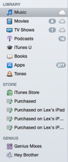
The first thing you’ll notice upon opening the new iTunes is that the sidebar—the one with links to your playlists, the iTunes Store, Books, Movies, Podcasts, and such—is gone. Apple describes the new look as an “edge-to-edge” design. Instead of using the sidebar, you rely on a dropdown for navigating between sections of the app, and a button at the upper right of the window takes you to the iTunes Store. But here’s a quick spoiler: If you can’t stand the dropdown approach, you can get the sidebar of old back. Go to the View menu and choose Show Sidebar. Bonus: The icons in the sidebar, which went to a faded grayscale in iTunes 10, regain their saturation in iTunes 11.
Another casualty of the “edge-to-edge” design is the status bar—you know, the one at the bottom that lists the number of songs in your library, or the current playlist, or what have you, along with how long it would take to play those songs and how much disk space they use. You can restore that as well with a trip to the View menu, by choosing Show Status Bar.
There’s a host of new user interface conceits in iTunes 11, making it seem almost like a testbed for Apple’s design. For example, the pop-up menus that appear when you click the black arrow button next to a song that you’ve selected feels more like something out of iOS than OS X. Clicking on a sub-menu item—Genius Suggestions, for example—doesn’t pop-open a sub-menu, but rather slides into a separate screen. Likewise, clicking on an album in the Album view slides open a list of songs in that album that resembles the iTunes Store (and includes a button that lets you quickly toggle over to that album in the store, as well).
You’ll see those pop-up menus all over, too. They don’t just show up when you click on the caret that appears when you mouse over songs in iTunes; they show up when you use new features like the Up Next option (see below), or when you hold the mouse over the currently playing song in the Now Playing header.
Up Next
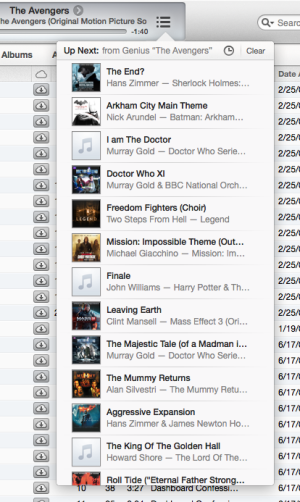
Up Next, accessible from an icon on the right edge of the header as well as the View menu, shows the next songs up in your queue. When it’s open, you can see the songs iTunes intends to play next, remove the ones you don’t want to hear, and reorder upcoming tunes as well. You can also click to see the most recently played songs.
You can click on the caret menu on an individual track and choose to add it to the Up Next list, or get more specific and specifically choose to play the chosen track next. You can also drag individual tracks to the Now Playing section to add it to the Up Next list.
Manually adding tracks to Up Next comes with an unusual caveat: When you do so, iTunes warns you if you try to switch playlists. Switching playlists, of course, means gaining a whole new set of songs to play “Up Next,” so you’ll see a dialog box prompting you to confirm whether you’d like to wipe out the current Up Next selection in favor of the new playlist you’ve selected. It’s a confusing if understandable interruption; you’re essentially saying yes, I want to play the songs I just said, not the songs I previously said I wanted to hear next. We expect this element of the iTunes 11 interface to evolve over time.
When you navigate to other playlists, you’ll see a playlist-specific Play button. Press it, and the music will either start right away, or after you deal with the Up Next clarification dialog described above. If you hold down Option, the Play button becomes a Plus instead; clicking it now adds the contents of the selected playlist to Up Next.
Album view
When you click onto an album, you get an expanded view stylized to match the album cover. iTunes 11 pulls out a color from the album cover, and uses that as the background color, with the font colors tweaked to look readable atop that color.
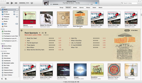
The expanded album view offers two toggles on the right side: Songs and In The Store. The former lists all the tracks you own for the selected album. The latter view moves the tracks you own to the left edge of the screen, sliding in iTunes Store items to fill the rest of the screen: top songs and albums from the artist in question, and recommended songs based on your theoretical enjoyment of the album in question. Disappointingly, however, the In The Store section happily lists songs for purchase even when you already own them—even when they’re listed directly adjacent on the track listing for the album you’re looking at.

If you do see an item you’re interested in owning, you can click to buy it without leaving the screen, or click to get more information from the iTunes Store. When you choose that latter option, though, there’s no easy way to get back to the album view you were in before you entered the store; the Back button navigates only the store, and doesn’t take you back to your music. When you click to go back to your music manually, the once-expanded album no longer is.
In earlier versions of iTunes, you could uncheck tracks as desired. Unchecked tracks could be skipped when shuffled, used in Smart Playlist creation, and such. That feature still exists in iTunes 11, with a tweak: In the expanded album view, you can’t see the checkboxes, but unchecked songs will appear grayed out. That’s mildly confusing, since such songs are still selectable, despite their gray appearance. (You can still toggle their checked or unchecked statuses via the Control-click/right-click contextual menu.)
When you’re finished looking at the expanded album view, you can click on an embedded close button, click on a different album, or run from your computer screaming.
MiniPlayer

Fans of the much neglected iTunes MiniPlayer have something to be psyched about in iTunes 11. The shrunken-size playback window is one of the marquee features of the new release; instead of being triggered by the green Zoom button, there’s now a dedicated MiniPlayer button in the upper right-hand corner of the window. By default, clicking that causes the main iTunes window to disappear and be replaced by the MiniPlayer, but you can also view both windows simultaneously: While the main window is open, go to Window menu and choose MiniPlayer.
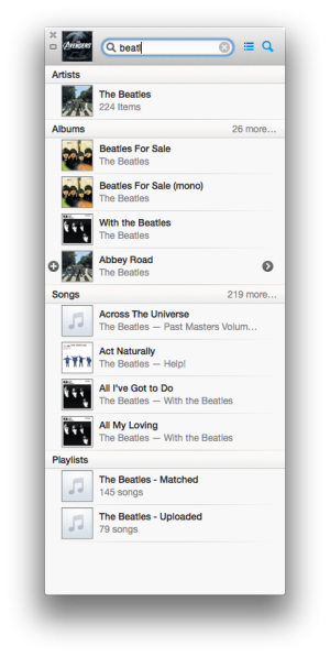
The MiniPlayer is far more functional than its predecessor, too. In its initial form, it displays the album art, track name, and artist, but as soon as you mouse over the window, it’ll switch to showing you playback controls: Previous Track, Play/Pause, and Next Track. There’s also an AirPlay speaker control, and a carat menu that lets you rate tracks, view them in the store, and more.
In addition, the MiniPlayer gives you constant access to the Up Next feature, as well as an integrated search feature. Click the magnifying glass icon and you’ll get a search field; enter a term in it, and you’ll get a list of matching items, displayed right in the MiniPlayer window. You can navigate through these via the keyboard for the most part, but sometimes you’ll need to use your mouse to show results beyond the initial few.
At any time you can dismiss the MiniPlayer by hitting the x button in its top left corner, or toggle back to the full screen by clicking the rectangular icon below it. You can also opt to have the MiniPlayer always float above all other windows by checking an option in the Advanced tab of Settings.
TV, movies, and streaming
Perhaps the most significant feature in iTunes 11—one that we can’t help but feel optimistic about because of its potential future impact—is its new support for streaming video content from iCloud. (This applies to podcasts and even music, too.)
Any content you purchase from the iTunes Store should appear playable (in the appropriate view), even if you haven’t downloaded it to (or have removed it from) your computer. That means that, for the first time, you can use iTunes to stream movies and TV shows that you’ve purchased, without downloading them first.

For music, this essentially functions as a pseudo (and very basic) iTunes Match implementation: You can stream songs that you purchased from the iTunes Store, even if they’re not your computer.
What’s more, Apple says that iTunes will now sync your place in movies and TV shows: If you start playing them on your Mac and pause playback, you can then switch to your iPad and pick up the video from right where you left off. In our early testing, that doesn’t seem to work yet.
By the way, if you’re looking for your music videos in iTunes 11, you’ll need to check the Music section, and then click on the Videos tab therein.
Store

As with iOS 6, Apple’s given the iTunes Store a bit of a makeover in iTunes 11. The category bar has been rearranged, and there’s a new Preview History feature, which lets you browse through all the media which you’ve previewed in the iTunes Store. That way, you can quickly re-preview any media again, or even buy that song that you previewed three days ago. You can also clear the list at any time, if you like.
The storefront itself now more closely resembles what you’ll see on the iPad, with an automatically cycling Cover Flow-style carousel of highlighted items.
Syncing
You’ll still use iTunes 11 for syncing your iOS devices (and traditional iPods). While the process remains the same, the visuals involved have scored a bit of an overhaul. The Summary and Info tabs get noticeable layout tweaks, and the Apps tab gives the app organization process a small redesign. Again, there’s no real usability difference, but Apple’s designers have done some redecorating.

When your iOS device or iPod is connected, you’ll either see it in the iTunes sidebar (if you reenable it), or as a button on the upper right of the iTunes window, next to the Store button. Bizarrely, there’s a second button—a button on the button, if you will—for ejecting the connected device.
With your device connected, you’ll see an “On this [iPad/iPhone/iPod]” tab as you look at it in iTunes. Clicking that device shows a breakdown of all the data on your device, and even lets you play the music or videos stored on it. If you click on the Add To button, iTunes 11 switches you back to a view of your library; you can drag music, videos, and other content onto your connected device, which appears in a new pane along the right side. (This won’t work properly if you have iTunes Match enabled. You can drag, but nothing happens—not even an error message explaining what’s wrong.)
Miscellaneous notes
One clever new addition that might go unnoticed is the ability to redeem iTunes gift cards using the camera on your computer. Click on your account name in the iTunes Store, choose Redeem, and click the Use Camera button. Hold your card up to the camera, and it’ll automatically detect the code from it, in a sort of Terminator-style camera mode.

The search window’s gotten a bit of revamp as well. Unlike the previous version, which limited your search to whichever type of media you were currently viewing, the new search gives you results from across your library. So, for example, you could be viewing movies, type the name of a song in, and it would display the match from your music collection. You can also move the cursor to the search field by using Command-F, which in iTunes 10 activated full-screen mode. (To use full-screen mode in iTunes 11, Command-Control-F or click the full-screen button in the top right corner.)
If you turn on Full Keyboard Access in System Preferences (under Keyboard), note that you can now switch through the previous, play/pause, next, AirPlay, and other buttons with the tab key. In our experience, that occasionally meant that we accidentally ended up restarting a track when we tried to use the spacebar to pause, because that button had become tab-selected.
There’s been a slight overhaul to the Books section of iTunes in the new version. At the top you’ll now see categories for Audiobooks, Books, PDFs, and Authors. This lets you quickly toggle between these various types of media, and also seems to provide an easier way to view PDFs synced from iTunes to your iOS devices.
Some views in iTunes 11 seem oddly truncated. The Videos list under the Music section, for example, lists all the music videos available in our libraries, but with all of their titles abruptly cut off to fit on one line.
CREDITS: Macworld & Techcrunch







Recent Comments