Home
Google unveils new logo and navigation bar, rolling out over the next few weeks
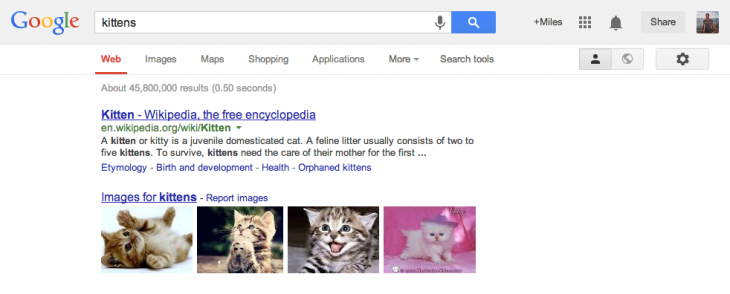
Google Thursday announced a new logo and navigation bar for all its websites. The company says it will be rolling out the update across “most” Google products over the next few weeks.
You can see the new navigation bar and Google logo in the following screenshot:
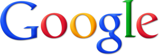
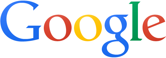
That Google logo is a bit small. Let’s take a closer look at the old logo and the new logo so you can see what’s changing.
Here’s the old one:
Here’s the new one:
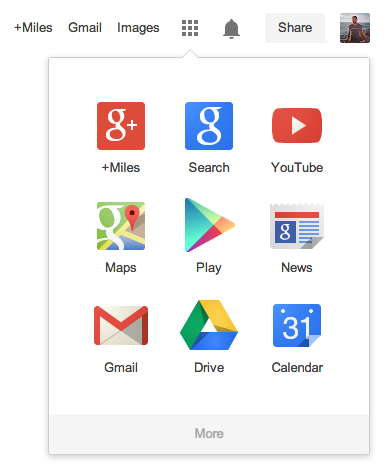
Those are the visual changes, but there are of course some functional ones too. The biggest difference is of course that all the Google services at the top have been merged into a grid apps menu located at the top right of the screen.
Google has been testing this new design since at least February. It is meant to be similar to the apps menus the company already offers on Android, Google Chrome and Google Drive.
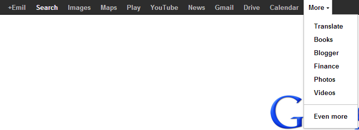
So again, we’re going from this:
To this:
It definitely looks better, but in many cases will require an additional click. In fact, for everything aside from Gmail and Images, you will have to click one more time just to switch to another Google service.
Yet Google says its goal is to minimize clutter. “Regardless of your routine, getting around Google should be seamless, and once you’re inside an app, you don’t want any distractions,” Eddie Kessler, Google Tech Lead, explains.
We’ll have to reserve judgment until we’ve used the new design for a few weeks. Right now we think it’s “alright” – it doesn’t look awful but it’s not exactly jumping out at us as huge improvement. What do you think?

















Recent Comments