Home
Twitter rolling out refreshed website to match the look & feel of its mobile apps
Twitter is rolling out an update to its website in an effort to have it mirror the look and feel of its iOS and Android apps. Some users are reporting that they have the updated look now, but if you don’t, most likely you will soon.
Included in this update, users will be able to personalize their profile some more — the settings menu now includes an option to add accent colors.
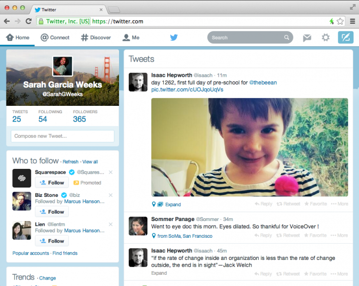
Here’s what the new Twitter.com looks like.
Users will notice that the navigation bar is a different color and style than before, matching what one would find on the mobile apps. Some of the icons have received an update as well, such as the one for direct messages.
Additionally, when looking at your home feed, your profile picture and background will now appear in the top left-hand side of the screen, right above where the number of Tweets you’ve sent are located.
This is only an aesthetic update — no new functionality was added to Twitter.com nor has anything changed on the service’s mobile apps.
Some users may have seen this design when accessing Twitter’s website — this is the small percentage of accounts that the company experiments with to gauge whether specific features, designs, and updates are appealing to the larger audience.
Photo credit: DAMIEN MEYER/AFP/Getty Images


Recent Comments