Home
YouTube begins rolling out a new, cleaner user interface as it makes finding playlists easier
YouTube is rolling out a set of changes to the video social network that helps you better discover playlists and makes the service more accessible.
With playlists, YouTube has streamlined the process, eliminating a step required to view videos in a particular playlist once it’s been liked. Before, once users liked the playlist, they had to go to their guide, click on the one they wanted to watch, and it would open up in a new window. Now videos can be played right within the guide screen, whether they’re your own curated ones or from channels that you’ve liked.
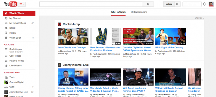
Lastly, in an effort to bring its Web app more in line with its mobile apps, YouTube has adjusted the design of its interface. It now features a center-aligned look, exactly what was seen back in January. The site now offers a much cleaner interface with more of a focus on the videos. Two links at the top of the screen allow users to navigate between recommended videos and their subscriptions.
In the new homepage redesign, you can also click on the guide icon that’s located to the right of the YouTube logo to view your playlists and subscriptions, along with other options.
Earlier this year, Tech2Notify discovered that YouTube was testing a new look and feel on the service. A spokesperson at the time confirmed the report, calling it an experiment designed to “help people more easily find, watch and share the videos that matter most to them.” Based on the feedback that it received, YouTube is ready to roll this out to its global community, though it could take a few hours or days to get to you.


Recent Comments